Stabilisation Score EF mount |
Calibration Data
There is no calibration data available for this camera as the Canon EOS R6 does not support any form of autofocus adjustment.
Calibration Data
There is no calibration data available for this camera as the Canon EOS R6 does not support any form of autofocus adjustment.
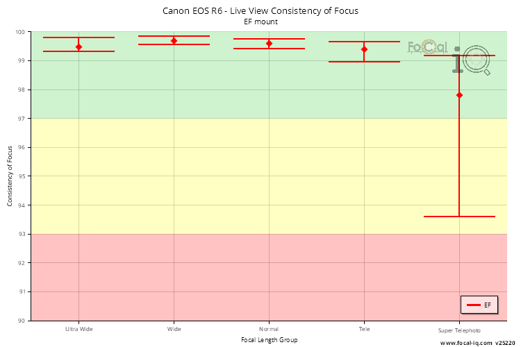
The Focus Consistency information shows the repeatability of focus operations for EF mount lenses on the Canon EOS R6.
Each metric is given a score between 0 (poor) and 100 (excellent). An overall score close to 100 suggests the camera autofocus system behaves consistently, although as FoCal IQ shows a view of all cameras, this does not mean that every example of this camera will behave the same.
Summary
The following information shows the metrics used to build the overall score:
| EF Mount | |
|---|---|
| Consistency of Focus (Live View) | 99.5% |
Live View Consistency of Focus
The data for Live View Consistency of Focus is derived from the AF Consistency test and the CalCheck tool.
| EF Mount | |
|---|---|
| Ultra Wide | 99.5% (5.1%) |
| Wide | 99.7% (13.8%) |
| Normal | 99.6% (14.9%) |
| Tele | 99.4% (30.3%) |
| Super Telephoto | 97.8% (14.9%) |
Calibration Data
There is no calibration data available for this camera as the Canon EOS R6 does not support any form of autofocus adjustment.
The Stabilisation information shows how the image stabilisation system works for EF mount lenses on the Canon EOS R6.
Each metric is given a score between 0 (poor) and 100 (excellent). An overall score close to 100 suggests the stabilisation system of the camera performs well, although as FoCal IQ shows a view of all cameras, this does not mean that every example of this camera will behave the same.
Summary
The following information shows the metrics used to build the overall score:
| EF Mount | |
|---|---|
| Handheld Stops Improvement | 5.0 |
| Average Quality Improvement (Handheld) | 20.7% |
| Average Quality Improvement (Tripod) | -0.9% |
| Improved Shutter Speeds (Handheld) | 96.2% |
| Degraded Shutter Speeds (Tripod) | 83.7% |
The data below is shown for the following data sets:
All Lenses
The following data is for all lenses (i.e. those with stabilisation like IS, VR etc, and those without). That data is shown for each mount.
Handheld Stops Improvement (All Lenses)
This chart shows the improvement in stops accumulated for all lenses attached to the Canon EOS R6.
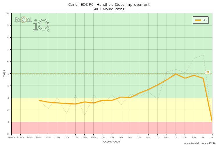
The data is calculated for individual FoCal Stabilisation Tests by finding the shutter speeds with matching quality levels when stabilisation is both active and disabled. For FoCal IQ we then combine all the data across the shutter speed range, then average the data from unique cameras (so a single camera cannot heavily influence the results irrespective of the number of tests performed).
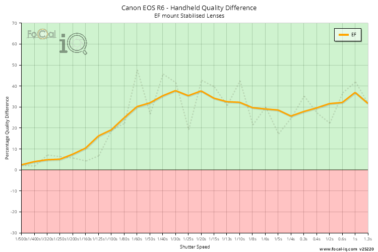
Handheld Quality Difference (All Lenses)
The Handheld Quality Difference chart shown below graphs the quality difference between a handheld shot with the stabilisation system active and inactive for each shutter speed.
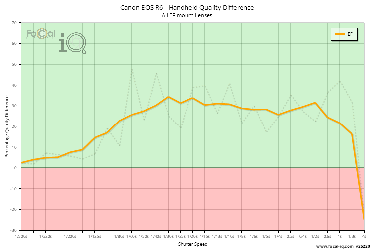
A value above 0 (in the green area of the chart) shows an improvement in quality when the image stabilisation system is active. If the image quality is degraded with the stabilisation system active, the point will have a value lower than zero and be shown in the red area.
The data is calculated from all Stabilisation Test results - we accumulate all the data for the various shutter speeds, average data for individual cameras (so a single user is represented with one data point irrespective of how many tests they perform) and then present the data below.
The thick line shows averaged results to smooth out any jaggedness from the raw data (which is shown by the faint dotted line).
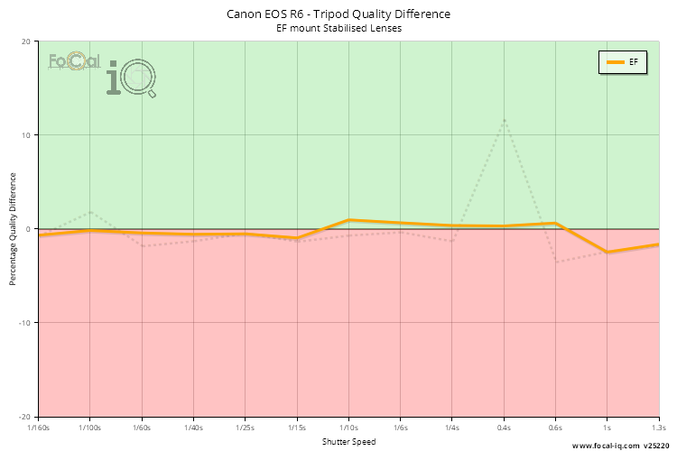
Tripod Quality Difference (All Lenses)
The Tripod Quality Difference chart shown below graphs the quality difference between a tripod-mounted shot with the stabilisation system active and inactive for each shutter speed.
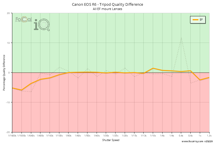
A value above 0 (in the green area of the chart) shows an improvement in quality when the image stabilisation system is active. If the image quality is degraded with the stabilisation system active, the point will have a value lower than zero and be shown in the red area.
The data is calculated from all Stabilisation Test results - we accumulate all the data for the various shutter speeds, average data for individual cameras (so a single user is represented with one data point irrespective of how many tests they perform) and then present the data below.
The thick line shows averaged results to smooth out any jaggedness from the raw data (which is shown by the faint dotted line).
Non-Stabilised Lenses
The following data is for lenses that don't have any stabilisation (e.g. VR, IS, OS etc) attached to the Canon EOS R6 - all stabilisation performance is gained purely by the in-body stabilisation system of the camera.
Handheld Stops Improvement (Non-Stabilised Lenses)
This chart shows the improvement in stops accumulated for all lenses attached to the Canon EOS R6.
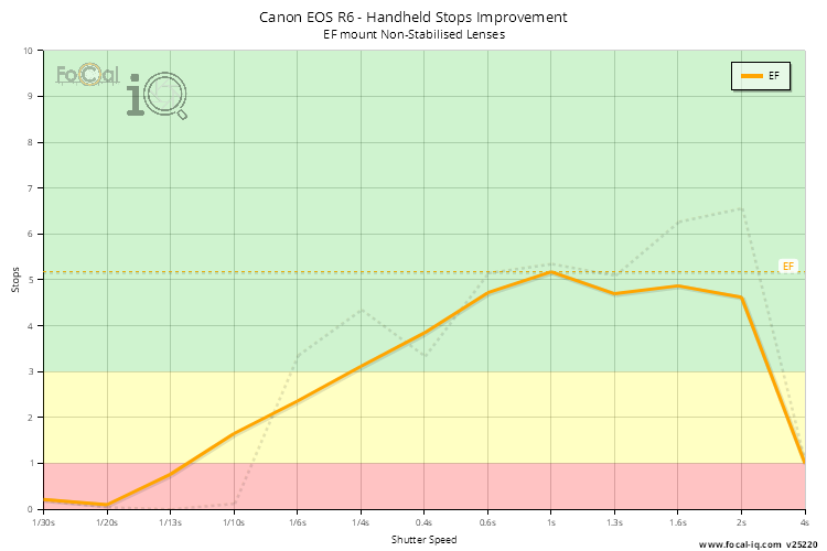
The data is calculated for individual FoCal Stabilisation Tests by finding the shutter speeds with matching quality levels when stabilisation is both active and disabled. For FoCal IQ we then combine all the data across the shutter speed range, then average the data from unique cameras (so a single camera cannot heavily influence the results irrespective of the number of tests performed).
Handheld Quality Difference (Non-Stabilised Lenses)
The Handheld Quality Difference chart shown below graphs the quality difference between a handheld shot with the stabilisation system active and inactive for each shutter speed.
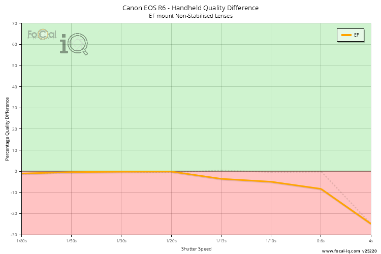
A value above 0 (in the green area of the chart) shows an improvement in quality when the image stabilisation system is active. If the image quality is degraded with the stabilisation system active, the point will have a value lower than zero and be shown in the red area.
The data is calculated from all Stabilisation Test results - we accumulate all the data for the various shutter speeds, average data for individual cameras (so a single user is represented with one data point irrespective of how many tests they perform) and then present the data below.
The thick line shows averaged results to smooth out any jaggedness from the raw data (which is shown by the faint dotted line).
Tripod Quality Difference (Non-Stabilised Lenses)
The Tripod Quality Difference chart shown below graphs the quality difference between a tripod-mounted shot with the stabilisation system active and inactive for each shutter speed.
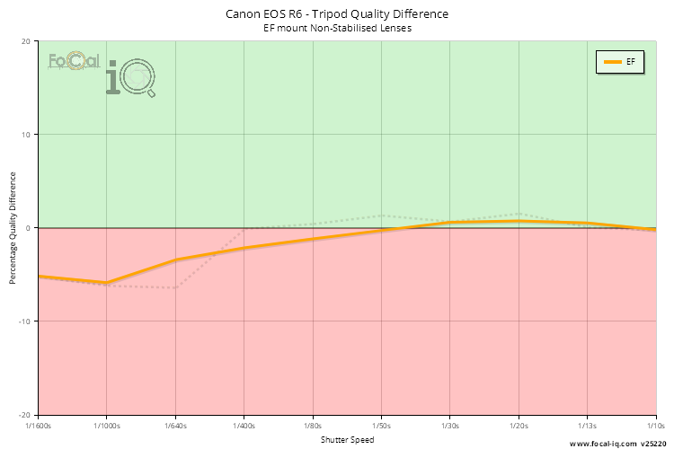
A value above 0 (in the green area of the chart) shows an improvement in quality when the image stabilisation system is active. If the image quality is degraded with the stabilisation system active, the point will have a value lower than zero and be shown in the red area.
The data is calculated from all Stabilisation Test results - we accumulate all the data for the various shutter speeds, average data for individual cameras (so a single user is represented with one data point irrespective of how many tests they perform) and then present the data below.
The thick line shows averaged results to smooth out any jaggedness from the raw data (which is shown by the faint dotted line).
Stabilised Lenses
The following data is for lenses that have their own stabilisation (e.g. VR, IS, OS etc) attached to the Canon EOS R6. The performance information below relates to how the camera decides to use the combination of it's internal in-body stabilisation and the lens stabilisation.
Handheld Stops Improvement (Stabilised Lenses)
This chart shows the improvement in stops accumulated for all lenses attached to the Canon EOS R6.
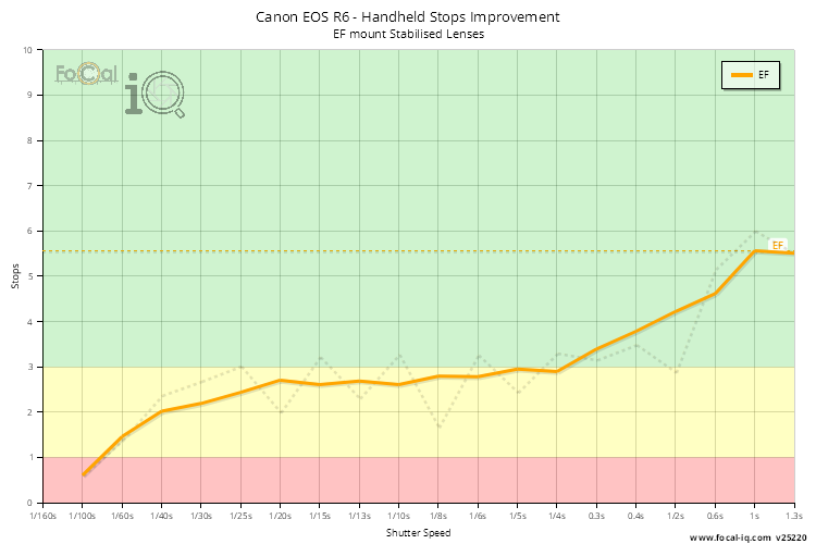
The data is calculated for individual FoCal Stabilisation Tests by finding the shutter speeds with matching quality levels when stabilisation is both active and disabled. For FoCal IQ we then combine all the data across the shutter speed range, then average the data from unique cameras (so a single camera cannot heavily influence the results irrespective of the number of tests performed).
Handheld Quality Difference (Stabilised Lenses)
The Handheld Quality Difference chart shown below graphs the quality difference between a handheld shot with the stabilisation system active and inactive for each shutter speed.
A value above 0 (in the green area of the chart) shows an improvement in quality when the image stabilisation system is active. If the image quality is degraded with the stabilisation system active, the point will have a value lower than zero and be shown in the red area.
The data is calculated from all Stabilisation Test results - we accumulate all the data for the various shutter speeds, average data for individual cameras (so a single user is represented with one data point irrespective of how many tests they perform) and then present the data below.
The thick line shows averaged results to smooth out any jaggedness from the raw data (which is shown by the faint dotted line).
Tripod Quality Difference (Stabilised Lenses)
The Tripod Quality Difference chart shown below graphs the quality difference between a tripod-mounted shot with the stabilisation system active and inactive for each shutter speed.
A value above 0 (in the green area of the chart) shows an improvement in quality when the image stabilisation system is active. If the image quality is degraded with the stabilisation system active, the point will have a value lower than zero and be shown in the red area.
The data is calculated from all Stabilisation Test results - we accumulate all the data for the various shutter speeds, average data for individual cameras (so a single user is represented with one data point irrespective of how many tests they perform) and then present the data below.
The thick line shows averaged results to smooth out any jaggedness from the raw data (which is shown by the faint dotted line).
Dust Score |
The Dust information shows how dust affects the sensor for the Canon EOS R6.
Each metric is given a score between 0 (poor) and 100 (excellent). An overall score close to 100 suggests the camera is less affected to dust, although as FoCal IQ shows a view of all cameras, this does not mean that every example of this camera will behave the same.
Summary
The following information shows the metrics used to build the overall score:
| All Mounts | |
|---|---|
| Widest Clean Aperture | f/3.2 |
| Typical Spot Count | 4.5 |
| Typical Spot Size | 0.13mm |
| Typical Spot Max Opacity | 7.2% |
| Typical Impact | 65.8% |
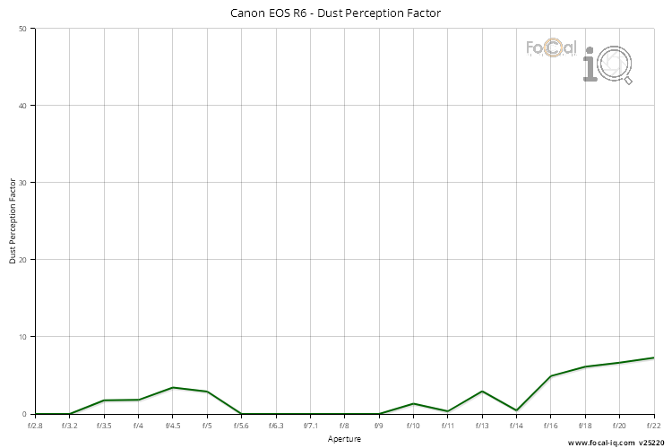
Dust Perception Factor
The Dust Perception Factor is a calculation which represents how likely you are to notice the dust spots on the sensor for typical shooting. A higher value indicates a higher likelihood of noticing the spots.
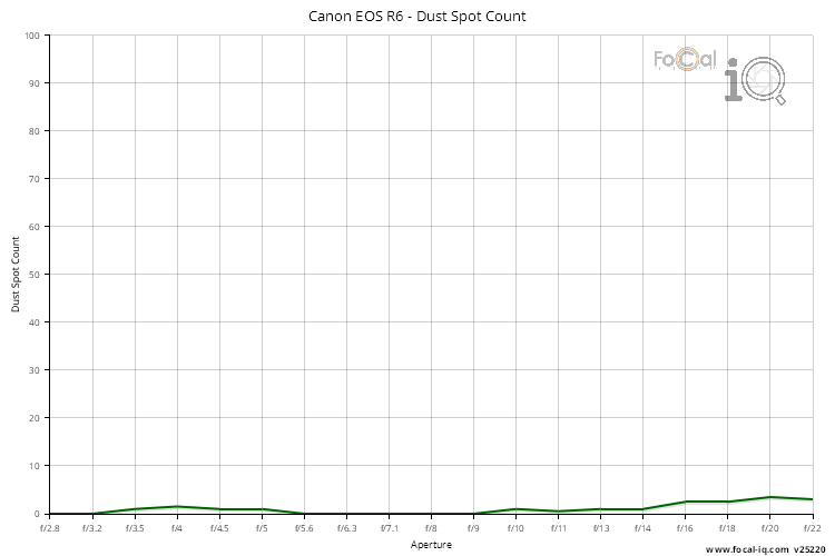
Dust Spot Count
The Dust Spot Count shows the typical number of spots found on the sensor during testing.
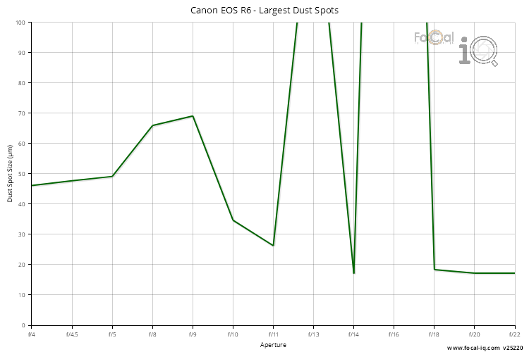
Largest Spot Size
The Largest Spot Size is the typical size (diameter in microns) of detected spots across the aperture range.
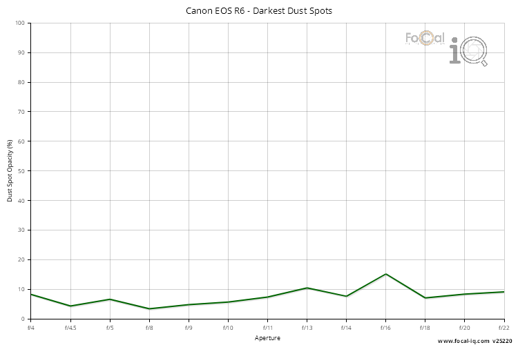
Maximum Opacity
The Maximum Opacity shows the typical opacity of the most obvious spot on the sensor.
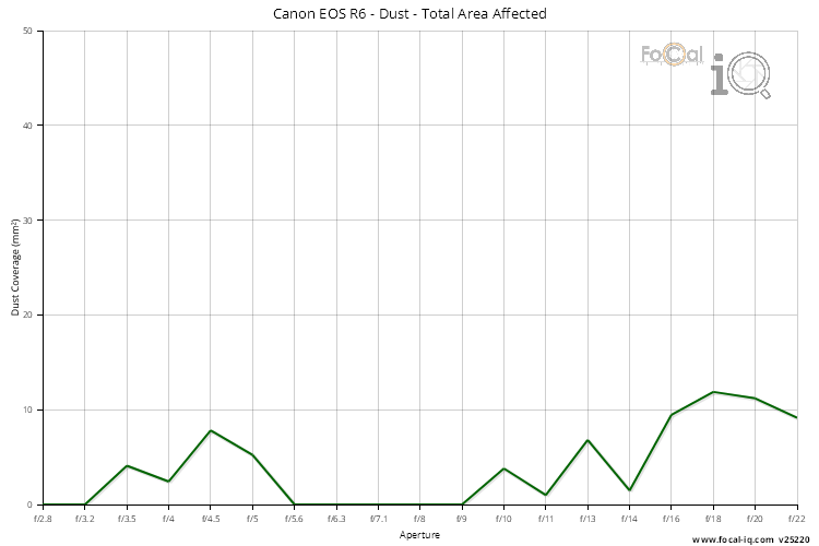
Total Area Affected
The total area affected is the typical coverage of all dust spots on the sensor.
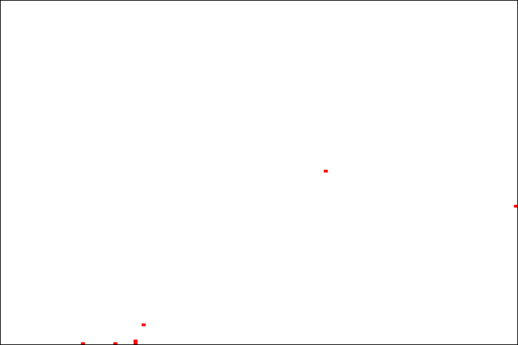
Dust Impact
The following image shows the average occurrence of dust spots on the sensor. A darker spot indicates that this area of the sensor sees more dust spots.
Hot Pixels Score |
The Hot Pixel information shows how hot pixels affect the sensor for the Canon EOS R6.
Each metric is given a score between 0 (poor) and 100 (excellent). An overall score close to 100 suggests the camera is less affected by hot pixels, although as FoCal IQ shows a view of all cameras, this does not mean that every example of this camera will behave the same.
Summary
The following information shows the metrics used to build the overall score:
| All Mounts | |
|---|---|
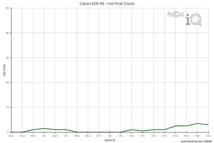
| Typical Hot Pixels | 1 |
| Widest No Hot-pixel Aperture | f/3.2 |
Hot Pixels
The Hot Pixels chart shows the typical number of hot pixels detected at each aperture.
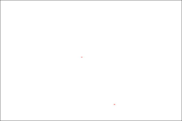
Hot Pixels
The following image shows the occurrence of hot pixels. The darker spots are detected across more apertures.
Spotted an error or have feedback about the site? Contact us